The tube zone you live in can become a form of identity. It says something about your economic means and social type. Are you, or your parents, stupendously rich yet somehow pay half the council tax everyone else does? (Zone 1.) Were you once cool, but now you have children? (Zone 3.) Does your morning consist of blearily watching your personal space slowly erode on the long commute? (Zones 6+.)
But this is Stockholm Syndrome. We’ve lived our lives as hostages to the zones for so long, we’ve begun to feel affection for our captors; even to dream that they might love us back.
They don’t, and this is a proposal to liberate ourselves and scrap them altogether. I’ll come to what we could replace them with — a system that would both save most passengers money and give TfL’s coffers a boost. But for now, just focus on the very obvious aesthetic reasons to show the zones the door. One of the simplest ways to alleviate the migraine-inducing effects of the modern tube map would be to de-zone it.
As a case study for this grand redesign, let’s take the Jubilee line. It cuts across Zones 1 to 5 and has no branches, making it a bit easier to deal with. And we’ll use peak journey prices for adults with no concession, to keep it simple.
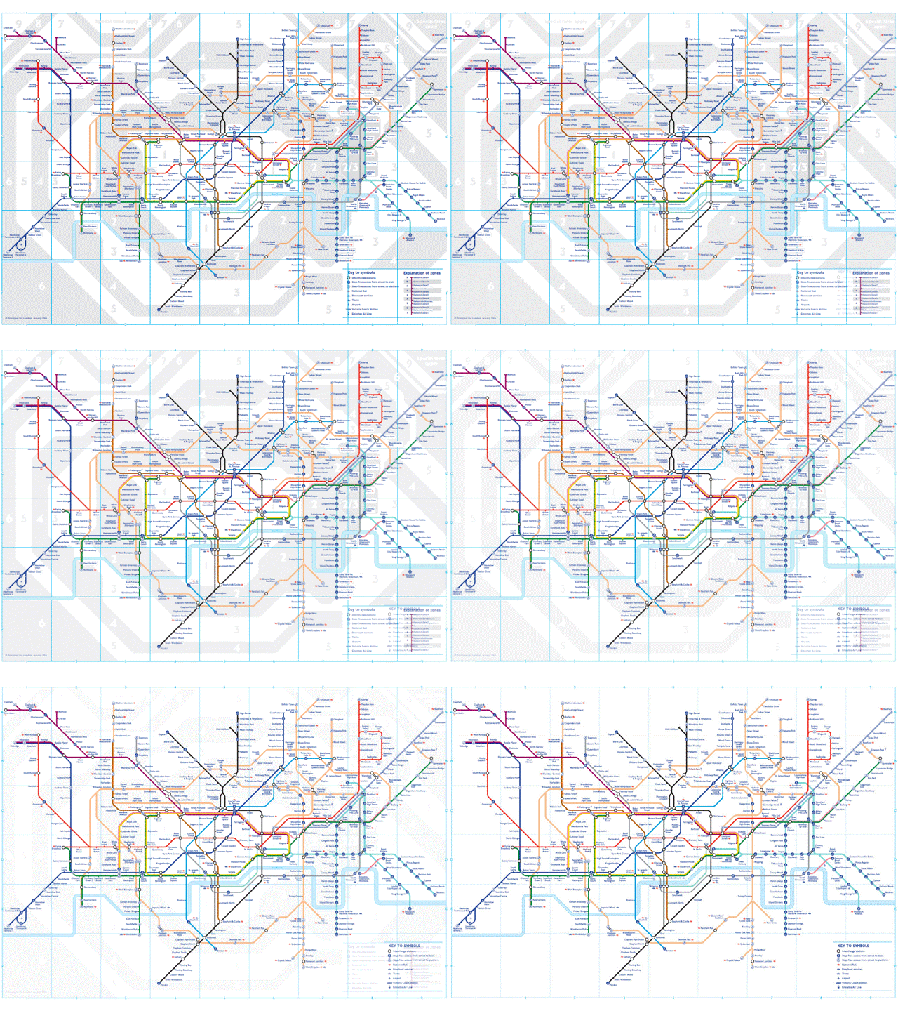
A quick look at the zones on the Jubilee line immediately flags up some problems.

Firstly, we need to talk about Zone 2/3 (on the right-hand side). The oozing 2/3 blob — which has to be made a different shade of grey on the map to prevent confusion — is something far too many Londoners have taken lying down. If you’re having to introduce a zone that is actually two zones at once, it’s a tacit acknowledgement that your tidy zone system isn’t really working.
Even worse, arguably, are the many stations like Willesden Green, placed on the boundary between zones. These are an attempt to smooth out the sharp price hike at a zone boundary — a problem the zones created in the first place. You need to draw a line somewhere, but as soon as you do, you have to start making exceptions.
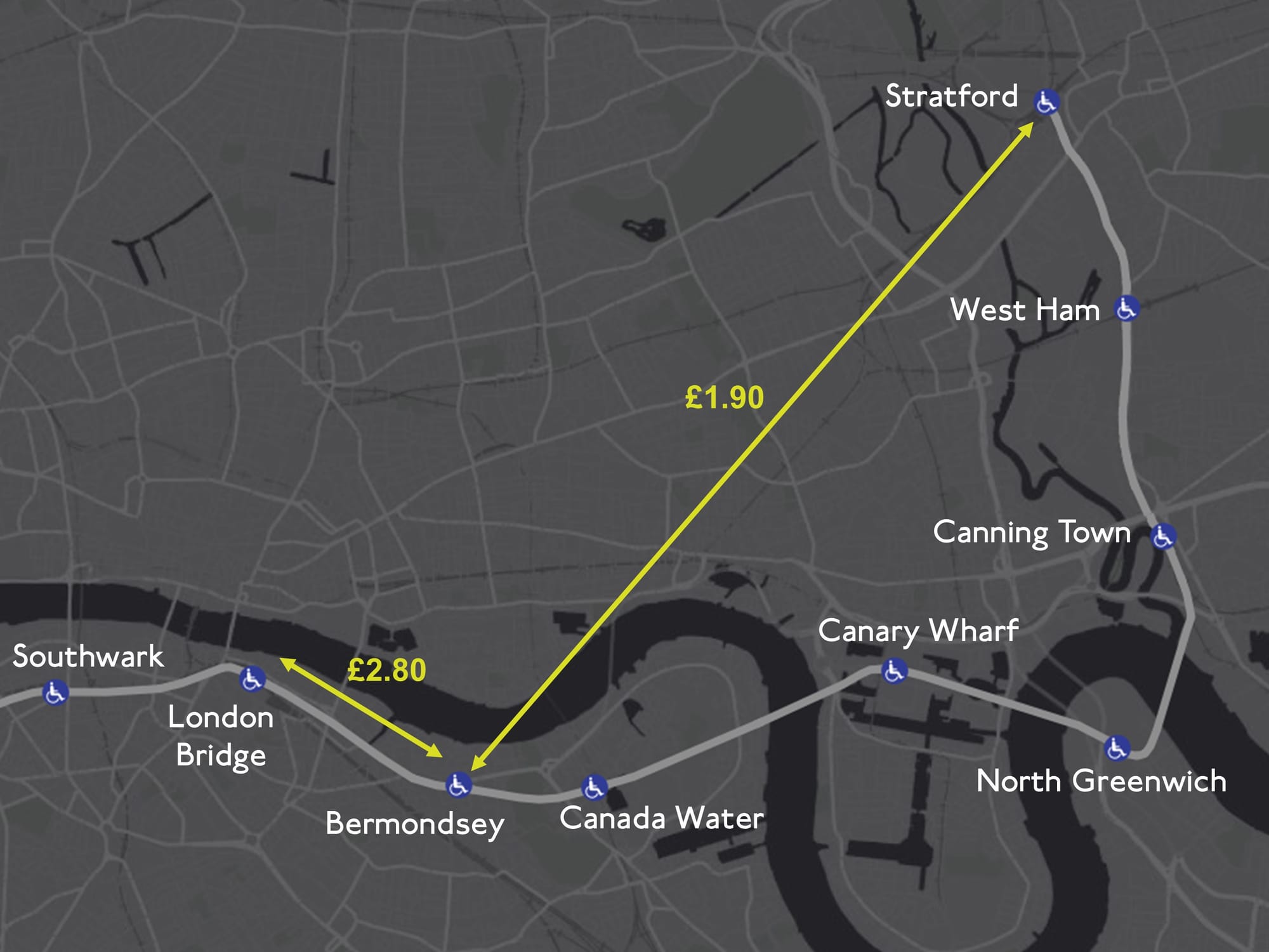
Secondly, the zones create some very weird pricing situations. For example, let’s suppose you’re getting on the tube at Bermondsey, in Zone 2. You could go westbound, to London Bridge in Zone 1. Just one stop on the line, but it’ll cost you £2.80. It’s only a 1.7km journey, so that works out at £1.67 per kilometre.
Or you could go east and travel all the way to Stratford. Because you stay in the same zone (well, you go from a Zone 2 to a Zone 2/3), it’s a third less — £1.90 — while you go almost four times the distance (6.4km). That’s a vastly cheaper 30p per kilometre. This seems clearly unfair, as well as creating economic distortions — the going rate for travel swings wildly across the network. On the Jubilee line, a journey from North Greenwich to Queensbury costs a mere 19p per kilometre, whereas a journey from Waterloo to Southwark costs £5.34 per kilometre.
So the zones create lots of weird distortions. But perhaps I’m overlooking their main advantage: simplicity. Zones, so the argument goes, are user-friendly. You can see which zone you’re going from and to, so you know how much the journey’s going to cost — no nasty surprises.
I’m not buying it. Firstly, I think if you asked most Londoners what a journey between Zone 5 and Zone 2 costs, they wouldn’t know (unless that happens to be their regular commute, in which case they’ve probably bothered to look it up). What if it’s Zone 2 to Zone 3, but going through Zone 1 on the way? Most people just wave their cards, phones, and Oysters over the scanner and get on with their day. You know roughly what it will be, and that’s enough.
Secondly, even if you’ve constructed a mind palace intricate enough to master zone pricing, you still can’t always be certain. That’s because deep down, in their heart of hearts, even TfL don’t fully believe in them. Occasionally, they fudge it.
Recall our short journey from Bermondsey to London Bridge. It was already a pretty hefty £2.80. But actually, it should be a fifth more: £3.40. If you travel to London Bridge from Canada Water, or any of the other stations in Zone 2, that’s what you’d pay.
But someone at TfL has looked at that, blown their cheeks out, and said, “Yeah, that is a bit steep.” So they’ve decided to allow Bermondsey to pretend it’s in Zone 1, but only for journeys to London Bridge. The same thing happens on the other side of Zone 1 — where both Swiss Cottage and St John’s Wood masquerade as Zone 1 stations if someone’s taking a quick hop to Baker Street. This is an awkward way to solve a problem the zones have created, which is that short journeys across the invisible Zone 1/Zone 2 line of death end up being hit with top whack.
So the zones should go. But how can we make it better?
Go farther, pay more
Let’s start with a simple intuition. The farther you go, the more you should pay. That’s why the Bermondsey to London Bridge vs. Stratford example looks so weird — you can get much farther, for less, if you go one way instead of the other. (I say “simple”. The Greens actually proposed a flat rate across the whole network at the last mayoral election, regardless of how far you were going. But they acknowledged this would cost "hundreds of millions" and would require the government to stump up the difference, so we’ll leave it to one side.)
Let’s begin by introducing a price per kilometre travelled. And by “kilometre travelled”, I don’t mean literally how much track you have trundled along, but rather the crow’s flight distance between where you started and finished. Of course this will throw up strange prices like £3.01 and £1.87. But the scanners are more than capable of handling it, and I don’t think it would bother users much.
We’ve got one binding constraint: I promised I wouldn’t lose TfL money. So what price per kilometre do we need?
To model this, I asked TfL for a mammoth spreadsheet showing the number of journeys between every pair of tube stations on the network last year. (They get this data from taps on the scanners — it doesn’t include day tickets.) In 2023, there were 61.4 million journeys where people tapped in, and out, on the Jubilee line. The most popular was the one-stop hop from North Greenwich to Canary Wharf.
If you apply existing zone prices, I calculate that TfL made just over £186 million from these journeys on the Jubilee line in 2023. That will be an overestimate, as I’ve calculated using adult peak fares, the most expensive type of ticket. But so long as the use of concessions is roughly the same across the line, it shouldn’t matter too much.
It turns out that to make the same amount, we’d need to charge 46p per kilometre, but let’s round up to 50p for comfort. If we charged everyone 50p for every kilometre between the stops they tapped in and out of, TfL would increase their takings by £14.5 million.
A simple rule — but are passengers being fleeced in the process? Here’s the interesting thing — while TfL would be making more money, most passengers would be paying less.
That’s because most journeys are short — in 2023, almost half of the journeys along the Jubilee line were four stops or fewer. And people taking quick hops like this save by switching to a pay-per-distance scheme.
Capping it off
There is a snag, though. Which is that people travelling long distances really would have to cough up. If you did the full journey from Stanmore to Stratford (admittedly a minority pursuit) you’d have to fork out £11.24. Which is quite a lot more than the £5.10 you were previously paying. That, in turn, raises the worry that longer-distance travellers drop out altogether, undermining the financials.
But this can be solved simply, using caps. Let’s suppose we decided to cap the cost of any single journey at £5. (That’s slightly lower than the current maximum on this line of £5.10.)
That pushes TfL back into the red (compared with the zones), so we’ll have to introduce a minimum cap as well. Which makes sense anyway, because every journey contributes a bit to the overheads, and some of the short journeys are coming out ridiculously cheap on our pay-per-kilometre scheme — such as the desultory 26p to travel between Waterloo and Southwark. Let’s introduce a minimum price of £1.50 — again, cheaper than the lowest price you would currently pay on this line, £1.90. (This also has the benefit of charging something to the tube tourists who get on, cruise the network, then get off at the same station, meaning they ultimately travel 0km.)
That makes our new price rule: “You pay 50p for every kilometre you travel, with a minimum fare of £1.50 and a maximum fare of £5.” This is easy to understand, and I think would strike most Londoners as fair. You’re paying more the farther you go, but a cap is in place to prevent it becoming extortionate. (This would be for peak times; you could use a lower price per kilometre at other times).
For one last time, let’s look at our passenger setting off from Bermondsey. The graph below shows the distance they travel to each station, westbound or eastbound, and the amount they end up paying under the old zone system (Jubilee Grey) and new pay-per-km system (The Londoner Red, not to be confused with Central line Red).
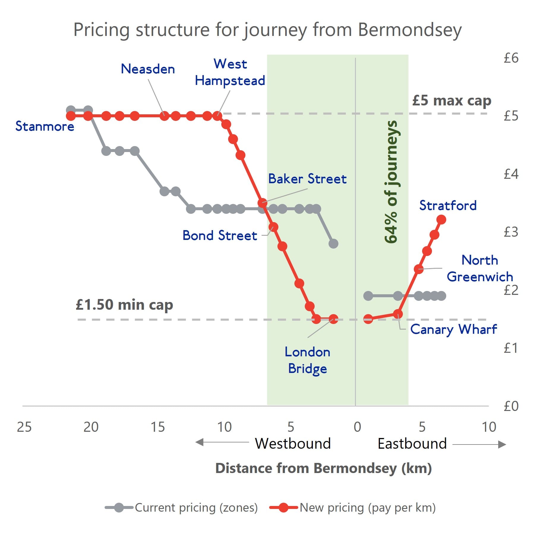
The shorter journeys are the cheaper journeys. If you go as far west as Bond Street, or as far east as Canary Wharf, you’ll pay less. Farther out, you’ll pay more, except at the far western extremity, thanks to the cap. Your biggest saving would be on a trip to Southwark, where you’d pay £1.90 less than you did under the zones (£1.50 vs £3.40). Your biggest price hike would be on a trip to West Hampstead, Kilburn or Willesden, where you’ll have to pay £1.60 more (£5 vs £3.40). If you set off from Bermondsey, your journey to most stations becomes more expensive (16 stations) rather than cheaper (10).
But don’t let that distract you — most people would have seen a saving. Almost two-thirds of journeys from Bermondsey fall in the cheaper zone (shown in green above). And the net result, when you roll out the system across the whole Jubilee line, is that TfL sees its takings go up slightly.
Finally, someone might argue that my modelling is ropey, because it assumes journey numbers remain the same — but people’s travel patterns would change if the prices changed.
Perhaps, but I think most tube users aren’t overly price-sensitive (not least because they often don’t know exactly what they’re paying). What’s more, without doing a full economic study, the balance of probability suggests any behaviour changes will raise more money for TfL than less.
That’s because most people’s journeys have become cheaper. All else being equal, they should travel on the network more; while the group who are incentivised to travel less is smaller. Those travellers are also the ones going longer distances, which means they generally have fewer alternatives, so they’re less likely to switch.
Zoning out
The zones were first introduced in the early 1980s. There were two reasons for them: to speed up ticket-buying (instead of purchasing specific end-to-end tickets) and to make pricing simpler. The advent of contactless payments means the first is now irrelevant, and the proliferation of zones has killed the second.
At first, they told us there were only going to be a couple of them. But over time they have spawned, with their children, grandchildren and now great grandchildren getting their feet under the table. They now encircle London menacingly, mutating into ever stranger shapes to cope with the expanding network. There are even secret zones, from 10 to 14, which never show their faces on the tube map, but they’re there, lurking.
Enough. We really, really don’t need them. A system that is fairer and easier to understand exists; we just need to embrace it. We have nothing to lose but our zones.
Do you agree the zones should be scrapped? Let us know in the comments.


